珠宝陈列的舞台上,主角当然是货品,但真正决定主角气场的,往往是被忽视的配角——背景板。同样的翡翠,放在白格里平平无奇,放进墨绿色丝绒格的瞬间,种水立刻显出来;同样的黄金,摆在纯白背景前金灿夺目,放在米金色背景里却像融进颜色里,黯淡一团。背景板是柜台里面积最大的色块,它不发声,却无时无刻不在和货品对话:颜色对比、材质反光、纹理干扰,都在悄悄影响顾客的注意力。选背景板,本质上是选一件"衬托的衣裳",选对了,几十元的道具也能衬托出高货的姿态。
先定主色:让货品的颜色跳出来
背景板的第一任务是制造对比,让货品从背景里"跳"出来。金色、玫瑰金、黄色宝石和暖色翡翠,适合深色冷调背景,墨绿、深蓝、深灰都能压住金光的张扬;白色、铂金、钻石和浅色珍珠,适合柔和浅色或灰色背景,避免亮白相叠失去层次;祖母绿这类特殊货品用同色系反衬,颜色顺延,宝石像长在背景里。判断标准很简单:把货品放在背景前拍一张照,第一眼看到的还是货品本身,背景就过关了。
材质决定质感:绒、皮、漆、木各司其职
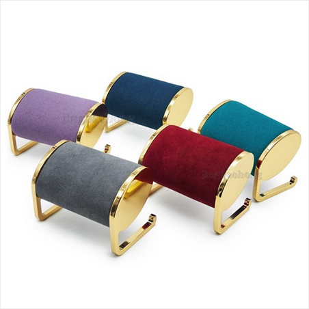
颜色定方向,材质定质感。丝绒是珠宝柜台最经典的选择,绒面吸光、不反光,深色绒能把灯光吸收大半,让货品成为柜内唯一的光源,立体感和贵气都靠它撑起来;麂皮和超纤皮比丝绒更挺括、更耐脏,适合大面积背景墙;哑光烤漆板质感现代,适合年轻品牌柜台;木纹背景自带温润气质,适合新中式、国潮品牌。反面教材也有:高光镜面背景板会把灯光和行人影子都反射进去,货品和干扰物叠在一起;带花纹的复合背景板纹理会和货品打架,除非特殊设计,否则慎用。
高度与比例:背景板不是越大越好
背景板的尺寸和柜型、视线高度有关系,不是整面铺满才算气派。柜内背景板上沿一般控制在顾客视线略上的位置,成年人站姿视线约在一百五十到一百六十厘米,视觉中心应落在这附近,太高要仰视,太低货品会被柜沿挡住;壁柜和陈列墙可以和层板错落布置,与隔板形成深浅交织的层次。背景板和托盘的比例也讲究:货品展示面占背景露出面积的三分之一到一半比较舒服,留白太少显拥挤,太多货品会被背景"吃掉"。先定柜型和视线,再定背景板尺寸,比凭感觉稳妥。
灯光在第一、背景板在第二
背景板再讲究,也逃不过一个前提:灯光先打对。背景板的使命是承接灯光、衬托货品,颜色和材质要考虑灯光的色温和角度:暖光下深色背景沉稳厚实,冷光下浅色背景清爽通透;射灯打在深色绒面上时绒面吸光,货品和背景明暗反差更大,宝石火彩更显;灯光太正,背景反被照得过亮,抢了货品风头。实操中先调好柜内灯光,再把候选色板放进亮灯后的柜子里实拍对比,哪个颜色让货品最出彩就用哪个。灯光是骨、背景是肉,顺序弄反了,事倍功半。
更换与维护:背景板也要"换季"
背景板不是一次装好就一劳永逸的。绒面背景长时间受灯光照射会局部褪色、起毛,建议每半年到一年更换一次;浅色背景板怕手印和喷雾残留,日常用软刷顺毛除尘;遇到店庆、节日或主题活动,背景板是最方便的换装道具——给主推货品换一块应景的深色背景,再配一小束装饰,节日氛围立刻出来,活动结束再换回来。有条件的门店可以准备两三套不同色系的背景板轮换:一套深色镇店、一套浅色走量、一套主题色应季,让柜台随时保持新鲜感。
背景板是柜台里最沉默的道具,却掌握着货品亮相的分寸。颜色制造对比、材质铺垫质感、高度照顾视线、灯光决定先后、维护保持状态,五件事做到位,一块普通的背景板就能让珠宝的颜值再上一个台阶。尚志优美居专注珠宝陈列设计与柜台道具,提供丝绒、麂皮、烤漆、木纹等多种背景板及配套托盘、灯光方案,欢迎结合柜型与货品咨询定制。
原创声明:本文由尚志优美居(szjym.com)原创,欢迎转载,请注明出处。专业珠宝陈列道具,欢迎咨询:https://www.szjym.com
On the stage of jewellery display the hero is of course the merchandise, but what truly decides its presence is often the overlooked supporting role — the back panel. The same jadeite looks ordinary in a white compartment, yet the moment it sits in a dark green velvet slot, its translucency and colour immediately show; the same gold gleams brilliantly against a pure white background, but placed against champagne-gold it seems to melt into the colour and turns dull. The back panel is the largest colour block in the counter. It never speaks, yet it dialogues with the merchandise every second: colour contrast, material reflection and texture interference silently shape the customer's attention. Choosing a back panel is essentially choosing a "dressing gown" — choose well, and a cheap prop can set off the poise of a high-value piece.
Fix the Main Colour First: Let the Piece Jump Out
The first job of the back panel is to create contrast so the piece "jumps" out of the background. The jewellery colour system broadly splits into warm and cool: gold, rose gold, yellow stones and warm jadeite suit deep, cool backgrounds — dark green, navy and charcoal all calm the flash of gold and sharpen metal outlines; white, platinum, diamonds and pale pearls suit soft light or grey backgrounds, avoiding bright-on-white that loses layering — diamonds on cream velvet are not wrong, but light grey or champagne shows the fire better. One special category uses tonal matching: emeralds on deep green velvet, where the colour continues into the background and the stone seems to grow out of it, with a quiet elegance of its own. The test is simple: photograph the piece against the panel — if the first thing the eye meets is still the piece, the background passes.
Material Decides Texture: Velvet, Leather, Paint and Wood
Colour sets the direction; material sets the texture. Velvet is the classic choice for jewellery counters: the pile absorbs light instead of reflecting it, and deep velvet swallows most of the lamp light so the piece becomes the only light source in the cabinet — its dimensionality and luxury both come from this. Suede and microfiber leather are crisper and more stain-resistant than velvet, suitable for cabinet backgrounds and large feature walls, and easier to maintain. Matte lacquered boards have a modern feel, ideal for young-brand counters, and with the right lighting achieve a minimalist premium look. Wood-grain backgrounds carry a warm temperament that fits new-Chinese and guochao brands, and sit naturally with the traditional contexts of jade and gold. There are also anti-patterns: glossy mirror panels reflect both lamp light and passing customers, stacking the piece against distractions until the eye is overwhelmed; textured or patterned composite back panels fight with the textures of the merchandise — avoid them unless specially designed.
Height and Proportion: Bigger Is Not Always Better
The size of the back panel relates to the cabinet model and eye level; covering the whole wall is not the only way to look grand. For panels inside display cabinets, the upper edge generally sits slightly above the customer's eye line — a standing adult's eye level is roughly 150 to 160 cm, so the visual centre of an in-cabinet panel should fall near this height; higher means customers craning upwards, lower means pieces hidden behind the cabinet rim. For wall cabinets and display walls, panels can be staggered with shelves so background and shelving weave depth into the composition, far more spatial than one flat surface. Proportion between panel and tray matters too: the piece's display area should occupy a third to half of the exposed panel; too little white space feels crowded, too much lets the background "eat" the piece. Decide the cabinet and sightline first, then derive the panel size — far safer than building a whole wall by feeling.
Lighting Comes First, the Panel Second
No matter how refined the back panel, one premise stands: the lighting must be right first. The panel's mission is to receive light and set off the piece, so its colour and material have to consider the colour temperature and angle of the lamps. In warm light, deep backgrounds look steady and substantial; in cool light, pale backgrounds feel fresher and more open. When spotlights fall directly on dark velvet, the pile absorbs light, the brightness contrast between piece and background grows, and gem fire shows more. But if the angle is too head-on, the background lights up brighter than the piece and steals its thunder. In practice, tune the cabinet lighting first, then select panel colour swatches against it: place several candidate swatches inside the lit cabinet and photograph them — whichever colour makes the piece most striking and the reflections most comfortable wins. Lighting is the bone, background is the flesh; get the order wrong and effort halves the result.
Refresh and Maintain: Panels Need Season Changes Too
A back panel is not installed once and forgotten. Velvet panels under long-term lamp exposure fade locally and pile up, creating colour differences against adjacent areas; replace them every six months to a year. Pale panels especially fear fingerprints and spray residue; for daily care brush along the pile with a soft brush and treat spots with velvet cleaner when needed. For anniversaries, festivals and campaigns, the back panel is the cheapest wardrobe change: give the hero piece a seasonal dark background, add a small decoration, and the festive mood appears at once — then swap back after the event; low cost, fast change. Stores with room can keep two or three colour systems on rotation — one deep set for anchor pieces, one pale set for volume sellers, one theme colour for the season — so the counter always feels fresh and regulars find a small surprise on every visit.
The back panel is the most silent prop in the counter, yet it holds the key to how a piece makes its entrance. Colour makes contrast, material builds texture, height serves the sightline, lighting decides the order, and maintenance keeps the state — do these five things well and an ordinary back panel lifts the look of the jewellery another level. Shangzhi Youmeiju focuses on jewellery display design and counter props, offering velvet, suede, lacquer and wood-grain back panels with matching trays and lighting solutions, and welcomes custom consultations based on cabinet models and merchandise.
Original article by Shangzhi Youmeiju (szjym.com). Reprints welcome; please credit the source. Professional display props: https://www.szjym.com


