珠宝门店的面积金贵,但几乎每家店都藏着两三处沉默地带:转角柜的犄角、靠墙的尽头、狭窄的过道。这些位置离主陈列柜远、客流动线复杂,常常被随手堆上杂物,或者干脆空着。然而在空间设计里,转角与角落恰恰是制造探索感的关键节点——顾客走路有惯性,视线却会被转角处突然出现的东西吸引。把转角、角落与过道用起来,门店不用扩大面积,也能白赚几条陈列动线。
转角柜:让视线拐一个弯
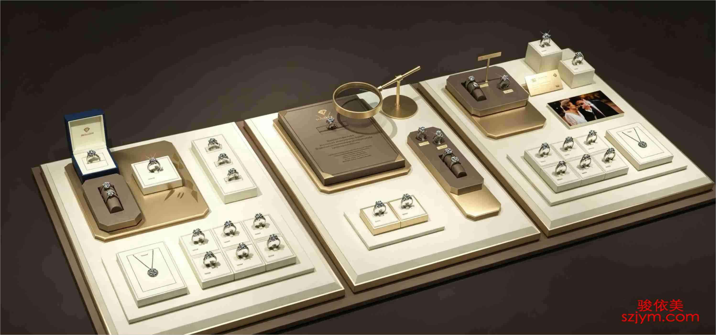
转角柜是连接两条柜体的折点,常见于L形或U形柜的转角处。转角位有两个问题:一是两面柜都顾不过来,二是顾客经过时视线通常朝向正前方,转角容易被滑过去。对应的陈列法,是在转角处放高一点、亮一点的物件:一只高于两侧柜面的立式展架、一盏重点射灯,或者一件带镜面的展示道具,用高度和光把扫过的视线拦一下,让视线在转角处停顿半秒。转角位不适合放蹲下细看的小件,适合放尺寸偏大的陈列件、主推套系或带故事性的货品组合,让拐弯变成一次遇到好东西的记忆点。转角柜的灯光也要单独设计:两侧柜体的灯一般从上往下打,转角位建议补一盏斜向侧光,既能照亮立式展架表面,又避免两面灯光叠加出阴影。转角空间够深时甚至可做小型岛柜,让顾客沿柜自然绕行,动线变环线,停留更长。
角落位:把尽头变成目的地
柜台的尽头、墙面的收尾处,是被浪费最严重的角落。顾客逛店很少走完最后一米,因为尽头看起来没有东西可看。把角落变成目的地,方法是在角落布置一个完整的小场景:一只独立展示柜、一面背景板加一组主题道具,或者把角落做成试戴与休整区,让顾客走到尽头愿意坐下来看。做角落陈列有三条原则:一是视线焦点要高于人的腰部,避免顾客弯腰探看;二是角落展区的灯光要独立于主柜,用一束光把角落从背景里抠出来;三是角落的货品要定期更换,让常客每次走到尽头都有新发现。小门店资金有限,也可以从一平方米起步:一张圆台、一套托盘、一盏射灯、一幅品牌海报,就能构成角落里的完整画面。角落陈列的货品建议以系列为单位,主推款放中间,配套款围在四周,顾客被吸引到角落后,有足够的内容可看可试,角落就不再是死角,而是一个独立的店中店。
过道位:动线上的三秒陈列
过道是移动通道,不适合长时间驻足,却适合三秒陈列——在顾客路过的几秒里递出信息。过道陈列道具首选轻薄型:地柜顶部条盘、墙面挂板、带轮小展车,都不占行走空间。内容上,过道位适合放引流型货品:当季主推、低门槛入门款,或者一句品牌口号配一件代表性商品,让顾客在路过时被勾住,主动转弯走向主柜。过道陈列的换新频率要比主柜更高,每两到三周调整一次,避免顾客对同一画面产生免疫。过道陈列还要注意高度与安全:展具顶部不要超过视线高度太多,避免遮挡主柜;地柜顶部的托盘建议加防滑垫和限位卡扣,防止顾客经过时碰落;展车要选静音轮并定期检查刹车,高峰时段把展车撤到不影响行走的位置。过道先保证通行,再谈陈列。
三条实用清单
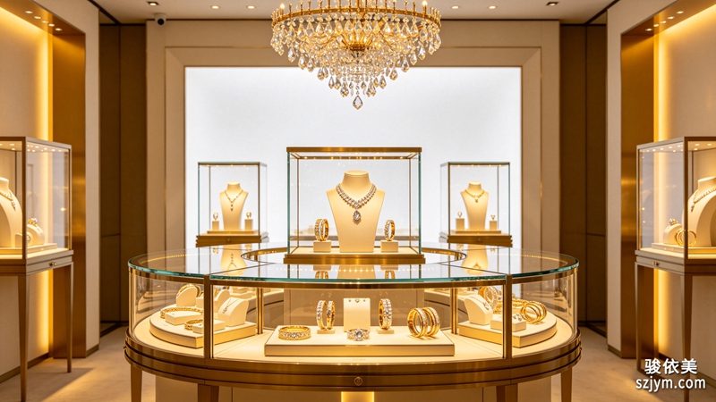
把转角、角落和过道用起来,有三个可以直接照做的动作:第一,给转角柜配一只高于柜面的立式展架和独立射灯,把转角变成视线停顿点;第二,给店铺最深的角落布置一个完整小场景,灯光独立、货品常换,让它成为顾客走完全程的理由;第三,过道只放轻薄展具与引流货品,两周换一次画面。空间还是那个空间,动线却会因此长出新的分支。珠宝陈列的本质是引导注意力,转角、角落和过道这些边缘地带,恰恰是注意力最容易松动、也最值得经营的地方。尚志优美居专注珠宝陈列设计与柜台道具,可提供展柜、转角柜、托盘、灯光等一站式配套,欢迎结合门店布局咨询定制。
原创声明:本文由尚志优美居(szjym.com)原创,欢迎转载,请注明出处。专业珠宝陈列道具,欢迎咨询:https://www.szjym.com
Jewellery store space is precious, yet almost every shop hides two or three silent zones: the corner of an L-shaped cabinet, the far end against a wall, or a narrow aisle. These spots sit away from the main display counters, sit on complicated customer flows, and are usually piled with odds and ends or left empty. In spatial design, however, corners and niches are exactly the nodes that create a sense of discovery — customers walk by inertia, but their eyes are caught by something that suddenly appears around a bend. Use the corners, niches and aisles well, and a store can gain several extra display routes without adding a single square metre.
Corner Cabinets: Let the Eye Make a Turn
A corner cabinet is the folding point between two counter runs, common in L-shaped or U-shaped layouts. It has two problems: neither side gets proper attention, and customers usually look straight ahead as they pass, so the corner slips by unnoticed. The fix is to place something taller and brighter at the corner — a vertical stand rising above the counter tops, a focused spotlight, or a mirrored display piece. Height and light intercept the sweeping gaze and make it pause for half a second. Corners are not for small items that need bending down; they suit larger display pieces, hero collections or merchandise with a story, turning every turn of the corner into a moment of discovery.
Niches: Turn the Dead End into a Destination
The end of a counter run and the tail of a wall are the most wasted corners. Customers rarely walk the last metre because it looks like there is nothing to see. To make a corner a destination, build a complete little scene there: a freestanding display cabinet, a backdrop panel with a themed prop group, or a fitting-and-resting zone so customers sit down at the end of the shop. Three principles apply. First, the visual focus should sit above waist level so no one has to bend down. Second, the corner lighting should be independent of the main counters — one beam pulls the corner out of the background. Third, rotate the merchandise regularly so returning customers find something new every time they reach the end.
Aisles: Three-Second Displays on the Flow Path
Aisles are passageways, not places for long pauses, but they are perfect for three-second displays — handing out a message during the few seconds a customer walks past. Aisle props should be light and slim: long trays on top of floor cabinets, wall hanging panels, or small wheeled display carts that take up no walking space. The content should be traffic-generating: seasonal hero pieces, low-threshold entry items, or a tagline paired with one representative product, so passing customers are hooked and turn toward the main counters. Refresh aisle displays more often than the main counters, every two to three weeks, so regulars never grow immune to the same picture.
Three Actionable Items
To put corners, niches and aisles to work, three moves can be applied directly. First, add a vertical stand and a dedicated spotlight to the corner cabinet so the bend becomes a visual pause. Second, build a complete scene at the deepest corner with independent lighting and rotating merchandise, giving customers a reason to finish their walk. Third, keep aisles to slim props and traffic items, refreshing the picture every two weeks. The space stays the same, but the traffic flow grows new branches. Jewellery display is ultimately about guiding attention, and these marginal zones are exactly where attention loosens — and where it is most worth cultivating. Shangzhi Youmeiju focuses on jewellery display design and counter props, offering cabinets, corner units, trays and lighting as one-stop solutions, and welcomes consultations based on store layouts.
Original article by Shangzhi Youmeiju (szjym.com). Reprints welcome; please credit the source. Professional display props: https://www.szjym.com


