为什么珠宝陈列道具的第一语言是颜色
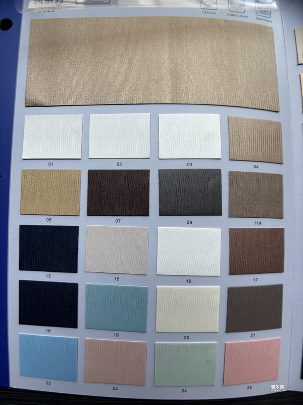
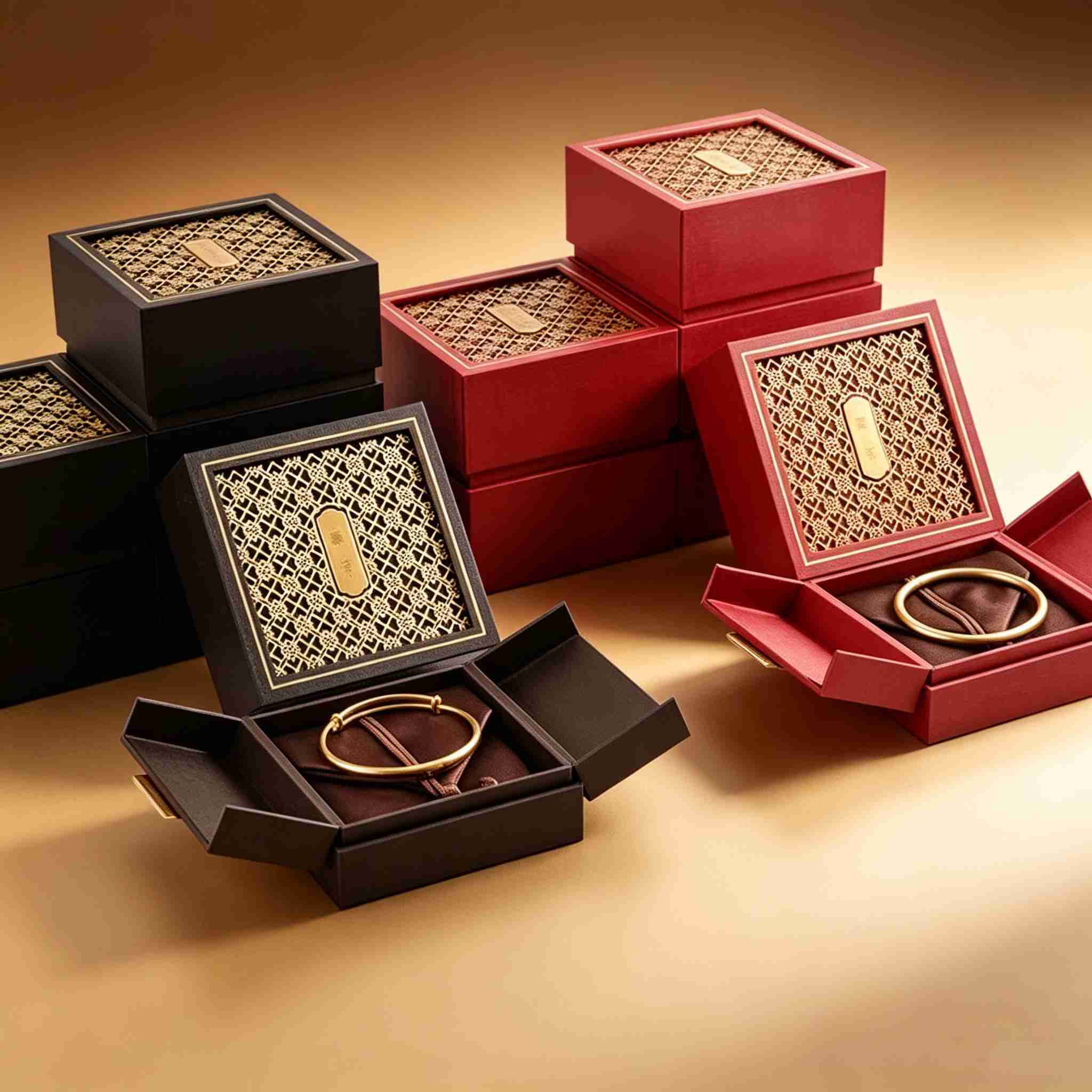
在珠宝零售场景中,顾客平均只给一件商品不到三秒的注意力。决定这短暂瞬间能否停留的,往往不是价格标签,而是陈列道具的色彩。珠宝陈列架、珠宝摆台、首饰盒的内衬与外壳颜色,构成了顾客对品牌的第一视觉印象。色彩心理学研究表明,暖色调传递温度与亲和,冷色调强调专业与高级,中性色则突出产品本身。对于珠宝道具设计而言,选对底色,等于替导购员提前完成了一次无声的沟通。
不同品类的珠宝对陈列底色有截然不同的需求。黄金与玫瑰金饰品在米白、浅咖、暖灰的衬底下更显温润;铂金与钻石适合纯白、冰蓝等冷色系以突出通透感;彩色宝石则需要低饱和度的灰调背景来压住杂色、让主石成为焦点。这正是珠宝陈列道具需要模块化、可换衬设计的原因——同一套陈列架,通过更换内衬颜色就能适配不同产品线的展示节奏。
用色彩分层引导顾客的视线动线
优秀的珠宝摆台不只是放产品的托盘,更是一套引导视线的语言。通过将主推款置于高对比度的暖色衬底、将引流款放在中性灰背景上,可以自然地把顾客目光牵引到利润款。色彩还能划分功能区域:入口处的珠宝陈列架用明亮色调制造欢迎感,中岛柜用沉稳深色营造专业感,体验台用柔和的香槟色降低购买决策的心理门槛。
在实际门店改造中,很多品牌忽略了灯光与陈列道具颜色的协同。同样的酒红丝绒衬底,在 3000K 暖光下高级感十足,在 6000K 冷光下却显得暗沉。珠宝包装与陈列团队在交付道具时,应当同步提供建议色温,让陈列效果在门店真实光环境下落地。这也是骏依美在珠宝盒、珠宝摆台定制服务中反复强调的"道具—灯光—产品"三位一体原则。
从陈列到成交:色彩如何缩短决策路径
当顾客在珠宝陈列架前停留超过十五秒,成交概率会显著上升。色彩的稳定性与一致性,是延长停留时间的关键。一套统一的色彩系统——从首饰盒内衬到橱窗背板都遵循同一套色卡——会强化品牌记忆,让顾客在离开后仍能回想起点亮购买欲的那一抹颜色。反之,杂乱撞色只会制造视觉疲劳,把潜在的成交机会推向竞品。
对中小珠宝品牌而言,不必追求昂贵的智能陈列设备,从一套可换衬的珠宝陈列架、几款与品牌色呼应的首饰盒开始,就能以极低成本完成陈列升级。深圳骏依美深耕珠宝道具与包装定制多年,支持来图打样与自有工厂快速交付,正是希望让每一个品牌都能用对的颜色,讲好属于自己的珠宝故事。
本文为原创内容,版权归深圳骏依美所有,转载请注明出处。
骏依美——专业珠宝包装与陈列道具定制服务商,专注珠宝盒、首饰盒、珠宝陈列架、珠宝摆台、手表陈列道具的设计与生产,深圳自有工厂,支持来图定制打样,欢迎咨询合作!
Why Color Is the First Language of Jewelry Display Props
In jewelry retail, a customer gives any single product less than three seconds of attention on average. What decides whether they stop is rarely the price tag, but the color of the display props. The lining and shell colors of jewelry display stands, display trays, and jewelry boxes form the customer's first visual impression of a brand. Color psychology shows that warm tones convey warmth and approachability, cool tones signal professionalism and luxury, and neutral colors let the product speak for itself. For jewelry display prop design, choosing the right base color is equivalent to completing a silent communication on behalf of the sales associate.
Different jewelry categories demand completely different display backgrounds. Yellow and rose gold look most lustrous against cream, light tan, or warm gray; platinum and diamonds call for pure white or icy blue to emphasize clarity; colored gemstones need low-saturation gray backgrounds to suppress clutter and keep the center stone in focus. This is precisely why jewelry display props need modular, interchangeable-lining designs — the same stand adapts to different product lines simply by swapping its lining color.
Guiding the Customer's Gaze with Color Layers
A great jewelry display tray is not merely a holder for products, but a language that guides the eye. By placing hero products on high-contrast warm linings and traffic-driving items on neutral gray, you naturally pull the customer's gaze toward margin products. Color also zones the space: bright tones at the entrance create welcome, deep dark at the island case conveys expertise, and soft champagne at the experience table lowers the psychological threshold of purchase decisions.
In real store renovations, many brands ignore the synergy between lighting and prop color. The same wine-red velvet lining looks luxurious under 3000K warm light but dull under 6000K cool light. When delivering props, the packaging and display team should also recommend a matching color temperature so the effect lands in the store's actual lighting. This is the "prop–light–product" trinity that Junyimei emphasizes in its jewelry box and display tray customization services.
From Display to Closing: How Color Shortens the Decision Path
When a customer lingers in front of a jewelry display stand for more than fifteen seconds, the closing probability rises markedly. Stability and consistency of color are the key to extending dwell time. A unified color system — from jewelry box linings to window backdrops following the same palette — reinforces brand memory, letting customers recall that spark of desire long after leaving. Chaotic clashing colors only create visual fatigue and push potential sales to competitors.
For small and mid-sized jewelry brands, expensive smart displays are unnecessary. Starting with a set of interchangeable-lining display stands and a few jewelry boxes echoing the brand color delivers a low-cost upgrade. Having specialized in jewelry prop and packaging customization for years, with an in-house Shenzhen factory supporting sampling from drawings, Junyimei exists to help every brand tell its own jewelry story in the right color.
This article is original content, copyrighted by Shenzhen Junyimei. Please indicate the source when reprinting.
Junyimei — Professional jewelry packaging and display prop customization service provider, specializing in jewelry boxes, jewelry pouches, jewelry display stands, display trays, and watch display props. Shenzhen-owned factory, custom design from drawings supported. Inquiries welcome!