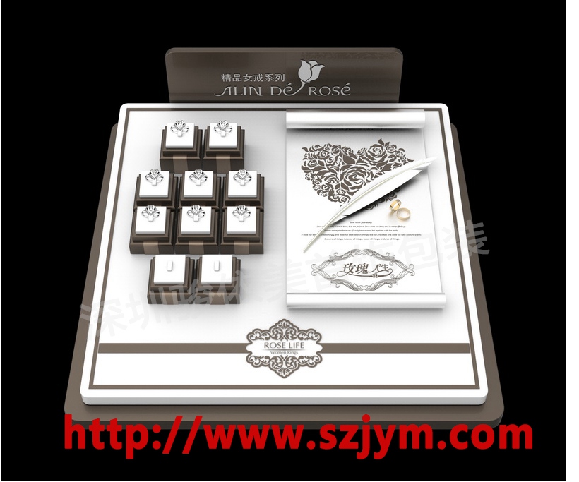
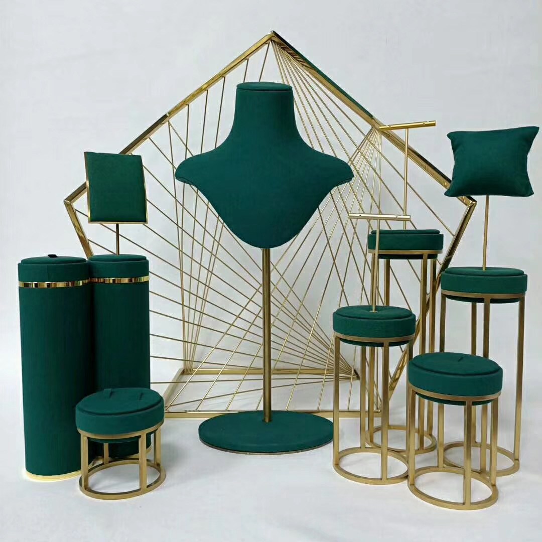
Inside a jewelry counter, lighting is the shadow partner of props. The same display prop, under different light, shows completely different texture. Display upgrade in a jewelry store is half props and half lighting. Props decide how goods are placed; lighting decides how goods are seen. Only when the two work together does the counter become truly persuasive.
The surface material of display props directly decides which lighting should be used. Light-absorbing materials such as velvet and leather suit slightly stronger accent light to make up brightness and highlight the metallic luster of goods; transparent and reflective materials such as acrylic and glass should avoid direct strong light and use softer diffused light to prevent glare from hiding details. Matching lighting with material is the first lesson of display.
Gold and diamond lighting are completely different. Gold needs warmer light to strengthen color saturation, around 3500K is most suitable; diamonds and platinum need near-neutral white light, around 4500K, to fully show fire and clarity. The color of the prop tray should match the light: dark velvet absorbs light and looks quiet, light velvet reflects light and looks bright. Choose according to the goods.
The position of accent lighting is the core of lighting design. Every promoted piece in the focal display area should have an independent accent light, with the beam slightly larger than the product silhouette, creating an obvious stage feel. Secondary lighting fills the overall brightness of the counter so customers do not feel dim. Ambient light controls the general atmosphere of the store, and its intensity should be two to three levels lower than accent light for clear layering.
Lighting angles should avoid vertical projection. Vertical light creates hard shadows on the product surface and hides jewelry details. The ideal angle is an oblique 30 to 45 degrees, letting light form a soft light-dark transition on the surface and enhancing the sense of depth. The height of props decides the position of lamps; shelf lights, cabinet top lights and bottom light strips should be arranged in layers.
In-counter light strips are a common upgrade method in recent years. Embed thin strips at the edge of trays, with light passing through from behind or the side of the goods, outlining the silhouette and creating a floating visual effect. This backlight technique suits jadeite and crystal with high transparency. The color temperature of strips should match the main light to avoid two light colors in one counter.
Lighting maintenance is an easily ignored part. Aging lamps suffer light decay, and color temperature drift makes the whole counter look dull. Regularly check lamp beads, replace aged tubes and wipe dust off covers, just like daily prop cleaning. Beyond hardware, dimmers and shading cloth let display designers flexibly adjust brightness by time and goods.
Zone-based grouping of lighting gives designers the ability to "light up the scene with one switch". Divide lamps in the same counter into basic, accent and atmosphere groups: basic group only during the day, accent group switched on at dusk to strengthen promoted goods, and all three groups at night for a glamorous feel. Switching light at different hours lets the same counter show completely different temperaments.
The color rendering index matters when choosing lamps. Higher-index lamps reproduce product colors more faithfully, and neither diamond fire nor colored gem saturation gets distorted. Jewelry counters should choose lamps with a color rendering index above 90; low-index lamps make gold look dark and silver look bluish, and long-term use can lead customers to misjudge product colors.
The placement of light strips needs timely correction. Installation height of shelf lights, the angle of cabinet top lights and the length of bottom strips should all be verified through actual effect after installation. Installation is not the finish line; photograph the counter and check whether the beams are even and free of dark areas after every adjustment.
Heat dissipation and safety are required courses in lighting design. Counter space is narrow, and overly powerful lamps accumulate heat that harms goods and velvet life. Choose low-heat LED lamps, reserve space for transformer heat, and run wiring hidden and secured. The beauty of lighting design must stand on safe and reliable foundations to deliver steadily over the long term.
Lighting design has no universal formula, only the patience of trial and error. After each adjustment, verify with both eyes and camera, and record which angle shines and which color temperature flatters the goods best. Turn experience into the store's own lighting manual so new staff can get started quickly. Good lighting is the most cost-effective long-term investment of a jewelry store.
The highest state of lighting plus props is letting customers forget the light exists and only remember the brilliance of the jewelry. This is design that does not show off. Treating lighting as part of the props, every counter in a jewelry store becomes a frame worth savoring.