珠宝陈列从来不是把货品摆上柜台那么简单。在门店里,陈列是"沉默的销售员"——它决定了顾客愿意停留多久、视线落在哪一件、以及最终为哪一份质感买单。一套设计讲究的珠宝陈列,往往要在视觉、灯光、材质与动线之间反复权衡。
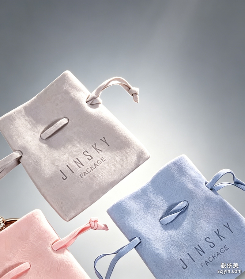
一、先定动线与视觉高度。人眼最舒适的视平线大约在 90–150 厘米之间,这被称为"黄金陈列带"。项链、戒指等高单价单品应落在这个高度,让顾客无需弯腰或仰头就能平视。柜台内部也要分主次:主推款占视觉中心,陪衬款退到两侧,避免平均用力。良好的柜台陈列动线,应当引导视线由入口款自然滑向高毛利款。
二、灯光是珠宝的第二张脸。钻石适合 4000K–5000K 的中性白光,能最大程度激发火彩;黄金与 K 金用 3000K 左右的暖光更显润泽;翡翠、珍珠则宜柔光,避免强曝失色。显色指数 Ra 建议≥90,色温与显色一旦错位,再好的主石也会显得灰暗。专业的珠宝灯光陈列,是把对的光打在对的材质上。
三、留白比堆满更高级。一面柜台只放 1–3 个视觉主角,其余做减法。过多堆叠会稀释单件的价值感,也让顾客的选择成本变高。用珠宝摆台制造高低错落,用亚克力或木质底座托起主石,焦点越集中,转化越容易发生。
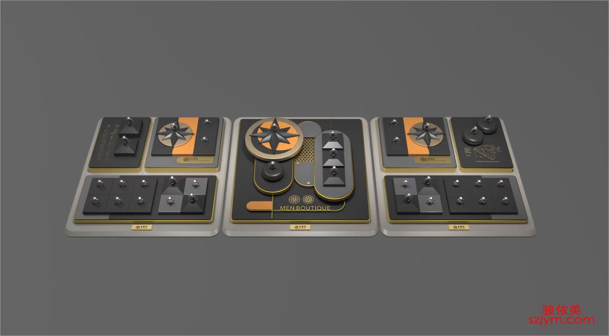
四、材质与道具要呼应品牌调性。丝绒显贵气,皮革显现代,亚克力显通透,原木显温度。选珠宝陈列道具时,材质语言必须和品牌一致——轻奢路线配哑光黑绒,国潮路线可配朱红或描金。道具不是配角,它是叙事的一部分。与之搭配的珠宝展示架也要在体量上收放有度,既托住主角,又不抢戏。
五、安全与防盗不能省。高价值裸石要用锁定展托,绒布内衬要够厚以防掉钻,监控与报警必须无死角覆盖。陈列再美,失窃一次就抵消十单利润。
六、跟着季节与主题更新。情人节用红、新春用金、盛夏用清透蓝,节令橱窗陈列能制造即时的话题与到店理由。定期微更新,比一年一换更能维持新鲜感。
说到底,讲究的珠宝陈列,是用空间讲故事:让顾客在驻足的几分钟里,先被光打动,再被质打动,最后被价打动。把动线、灯光、留白、道具、安全、节奏这六件事做对,柜台自然会从"货架"变成"剧场"。
本文为原创内容,版权归骏依美所有,如需转载请注明出处。
骏依美——21年专做珠宝包装,让每一件珠宝都被更好地呈现、收纳与珍藏。
Jewelry display is never just about placing stock on a counter. In a store, the display is the "silent salesperson" — it decides how long a customer lingers, where the eye lands, and which piece of craftsmanship they eventually pay for. A well-designed jewelry display balances vision, lighting, material and flow.
1. Map the flow and the eye level. The most comfortable viewing band sits roughly between 90 and 150 cm — the "golden display zone". High-value rings and necklaces belong here so customers can see them straight on. Inside the case, lead with hero pieces at the center and let supporting items recede to the sides. Good counter display guides the gaze from the entrance piece toward the higher-margin hero.
2. Light is the second face of jewelry. Diamonds shine under neutral white light around 4000K–5000K that ignites fire; gold and rose gold look richer under warm 3000K; jade and pearls need soft light to avoid blow-out. Keep color rendering index Ra at 90 or above. Proper jewelry lighting display puts the right light on the right material.
3. White space reads as premium. Show one to three heroes per case and subtract the rest. Over-stacking dilutes perceived value and raises choice cost. Use jewelry display stands to build height, acrylic or wood bases to lift the center stone — the tighter the focus, the easier the conversion.
4. Material must echo the brand. Velvet feels luxe, leather feels modern, acrylic feels clear, raw wood feels warm. When choosing jewelry display props, the material language must match the brand — matte black velvet for minimal luxury, vermilion or gilt for a Chinese-wave line. Props are not supporting actors; they are part of the story. The paired jewelry display stand should also scale with restraint: holding the hero without stealing the show.
5. Security is non-negotiable. Lock loose stones in secured mounts, use thick velvet liners to prevent loss, and cover every angle with monitoring and alarms. One theft can erase the profit of ten sales.
6. Refresh with season and theme. Red for Valentine's, gold for Lunar New Year, cool blue for summer — seasonal window display creates instant talk and a reason to walk in. Small regular updates beat a once-a-year overhaul.
In the end, a refined jewelry display tells a story in space: let light move them first, material next, price last. Get flow, light, white space, props, security and rhythm right, and the case becomes a stage rather than a shelf.
This is original content. Copyright belongs to Junyimei.
Junyimei — present every jewel at its best.


