灯光为什么会直接影响进店转化?
珠宝是靠光生存的商品。顾客通常在门店外三到五米做出是否进店的决定,而这个决定几乎完全由橱窗的亮度对比与珠宝的闪烁感驱动。研究门店动线的人常说,珠宝陈列道具负责搭建视线路径,灯光负责在路径终点制造停留。如果道具做得很讲究,灯光却平淡,商品会显得沉闷;反之灯光很强但道具混乱,顾客会觉得刺眼而不愿细看。骏依美在配套珠宝摆台时,通常会同步确认门店的灯位、色温与照度,让道具的高度与角度与光线匹配。
陈列道具的材质与颜色该如何配合灯光?
道具其实是光的第二个来源。哑光绒面吸光,能压住杂乱反射,让主石成为唯一亮点,适合钻饰;高光烤漆与镜面亚克力会产生二次反射,制造通透感,适合彩宝与轻奢线;木质与皮革反射柔和,适合古法金与传统工艺。颜色上,浅色台面会抬高整体亮度但可能削弱对比,深色台面对比强烈却容易吃光,需要提高照度补偿。选择珠宝陈列道具时,建议把台面小样直接拿到门店灯下比对,而不是只看图片或效果图。
钻石、黄金与彩宝分别适合什么色温?
常规经验是:钻石与铂金适合较高色温,约四千至五千开尔文,冷白光能突出火彩与切工;黄金与古法金适合较低色温,约三千开尔文,暖光让金色更饱满;彩色宝石则要按色系细分,红宝与石榴石在暖光下更艳,蓝宝与海蓝宝在中性光下更清透。显色指数同样重要,建议选择显色性高的灯具,否则再贵的珠宝在灯下也会发灰。同一柜内混放不同品类时,可以用局部射灯做分区补光。
珠宝摆台的高度与角度应该怎么设计?
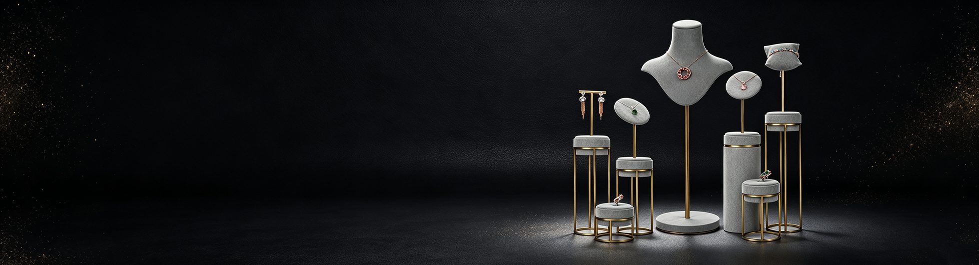
摆台的核心任务是把珠宝抬到顾客最省力的观看高度,并让主受光面对准光源。柜内展示的黄金高度通常在台面以上八到十八厘米,形成前低后高的阶梯,避免后排被遮挡。角度方面,项链托的倾斜约十五到二十五度最利于展示吊坠正面,戒指座则要略微前倾,让台面射灯的光打在主石冠部而不是指圈上。骏依美做定制摆台时,会按客户主推品类调整托面倾角,而不是套用统一模板。
橱窗与柜内灯光要怎么分层?
成熟的门店灯光通常分三层:基础照明保证空间不压抑,重点照明用射灯打亮主推商品,氛围照明用灯带勾勒结构与品牌色。橱窗的亮度一般要高于室内基础照明,才能在白天形成吸引力;柜内则相反,需要控制眩光,灯带应藏在挡光条后面。分层的意义在于让顾客的视线有主次,先被橱窗吸引,进店后被重点照明引导到主推柜,最后在氛围光中完成停留与试戴。
常见的灯光误区有哪些?
第一是唯亮度论,把所有灯开到最亮,结果失去对比、珠宝反而不突出。第二是忽视眩光,射灯直射顾客眼睛或反射到玻璃上,试戴体验很差。第三是色温混杂,同一空间冷暖光交错,商品颜色失真。第四是忽略热量,小柜体内密集布灯会升温,长期烘烤对皮质道具与部分有机宝石不友好。第五是灯具老化不更换,色温漂移后陈列效果整体下滑,而店员往往察觉不到。
街铺、商场店与展会的灯光策略有何差异?
街铺白天面临自然光竞争,橱窗照度必须做得更高,而且要考虑玻璃反光的角度;商场店环境光相对稳定,重点是与商场基础照明拉开对比,通常靠柜内重点光与深色道具背景实现;展会摊位停留时间短、人流密度大,灯光要更直接,道具要更高更集中,让珠宝在两三米外就能被看到。三种场景对珠宝陈列道具的高度、稳定性与拆装便利性要求也不同,展会尤其需要可快速拆装的模块化摆台。
道具与包装如何形成统一视觉?
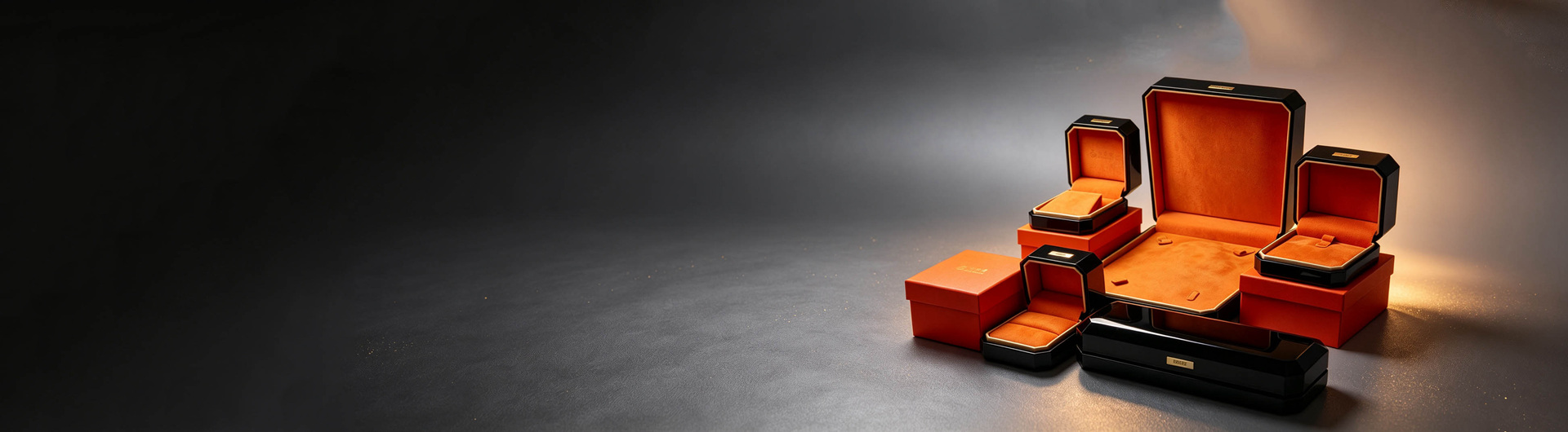
顾客在柜台看到的托盘绒面,和拿回家的首饰盒内衬,如果颜色与手感一致,品牌记忆会成倍加强。实现方式很简单:让珠宝陈列道具与饰品包装盒使用同一批面料与同一套色号,甚至共用同一份工艺标准。骏依美的做法是把道具与包装放在同一个项目里排产,避免两个供应商做出两种颜色。首饰袋与手表盒也应纳入同一体系,让整个触点链条保持一致。
预算有限时,应该先投灯光还是先投道具?
如果只能二选一,多数情况下先投灯光。更换几支高显色射灯的成本,往往低于整套道具翻新,但对商品呈现的提升更直接。道具则可以分阶段升级:先更换主推柜的珠宝摆台与托盘,观察转化变化,再逐步铺开。需要提醒的是,灯光与道具是乘法关系而非加法关系,长期来看两者必须同步规划,否则单独提升任何一方,收益都会很快见顶。
本文为原创内容,版权归骏依美所有。如需转载请注明出处。
Why does lighting decide whether shoppers step inside?
Jewelry is a product that lives on light. Customers usually decide whether to enter a store from three to five meters away, and that decision is driven almost entirely by window brightness contrast and the sparkle of the merchandise. Store planners often say that jewelry display props build the visual path while lighting creates the pause at the end of it. If props are beautifully made but lighting is flat, the products look dull; if lighting is powerful but props are disorganized, shoppers find the scene glaring and refuse to look closely. When Junyimei supplies jewelry display stands, we confirm the fixture positions, color temperature and illuminance of the store first, so prop height and angle match the light.
How should prop materials and colors respond to lighting?
Props are effectively the second light source in a case. Matte velvet absorbs light and suppresses stray reflections, leaving the center stone as the only bright point, which suits diamonds. Gloss lacquer and mirrored acrylic create secondary reflections and a sense of transparency, which suits colored stones and affordable luxury lines. Wood and leather reflect softly, suiting heritage gold and traditional craftsmanship. In terms of color, pale surfaces raise overall brightness but can weaken contrast, while dark surfaces create strong contrast yet swallow light, requiring higher illuminance to compensate. Always compare surface swatches under the actual store lighting rather than judging from photographs.
Which color temperature suits diamonds, gold and gemstones?
The general rule is that diamonds and platinum favor higher color temperatures, roughly four thousand to five thousand kelvin, where cool white light emphasizes fire and cut quality. Yellow gold and heritage gold favor lower temperatures around three thousand kelvin, where warm light makes the metal look richer. Colored stones must be treated by family: rubies and garnets glow under warm light, while sapphires and aquamarines read cleaner under neutral light. Color rendering index matters just as much; with poor rendering, even the most expensive piece looks grey. When one case mixes categories, use narrow spotlights to create separate lighting zones.
What height and angle should a display stand use?
The main job of a stand is to lift jewelry to a comfortable viewing height and turn its primary face toward the light. Inside a counter, the golden zone usually sits eight to eighteen centimeters above the deck, arranged as a low front and high back staircase so rear pieces are not blocked. On angles, a necklace bust tilted fifteen to twenty five degrees shows the pendant face best, while a ring seat should lean slightly forward so the spotlight strikes the crown of the stone rather than the band. For custom stands, Junyimei adjusts the tilt of each surface to the client hero category instead of applying one template everywhere.
How should window and in case lighting be layered?
Mature retail lighting works in three layers. Ambient light keeps the space from feeling oppressive, accent spotlights highlight hero products, and decorative strips outline architecture and brand color. Window brightness normally needs to exceed interior ambient light to remain attractive during daylight hours. Inside a case the opposite applies: glare must be controlled and strips hidden behind shielding trim. Layering gives the customer eye a hierarchy, attracted first by the window, guided by accent light toward the hero counter, and finally held in the atmospheric layer during try on.
What are the most common lighting mistakes?
First, worshipping brightness by turning every fixture to maximum, which destroys contrast and makes jewelry disappear. Second, ignoring glare, so spotlights shine into customer eyes or bounce off glass and ruin the try on experience. Third, mixing color temperatures within one space, distorting product color. Fourth, ignoring heat, because densely packed fixtures inside a small case raise temperature and slowly damage leather props and certain organic gems. Fifth, never replacing aging lamps, so color temperature drifts and the whole display quietly declines while staff fail to notice.
How do strategies differ for street stores, malls and trade shows?
Street stores compete with daylight, so window illuminance must be higher and glass reflection angles must be planned carefully. Mall stores enjoy stable ambient light, so the priority is creating contrast against the mall base lighting, usually through strong accent light and darker prop backgrounds. Trade show booths face short dwell times and dense traffic, so lighting must be direct and props taller and more concentrated, letting pieces be seen from two or three meters away. Each scenario places different demands on prop height, stability and ease of assembly, and exhibitions in particular need modular stands that dismantle quickly.
How do props and packaging create one visual language?
If the velvet tray a customer sees at the counter matches the lining of the jewelry box they carry home in both color and texture, brand memory strengthens dramatically. The method is simple: use the same fabric batch and the same color references for display props and jewelry gift boxes, ideally under one shared craft standard. Junyimei schedules props and packaging within a single project so two suppliers do not deliver two different shades. Jewelry pouches and watch boxes belong in the same system, keeping every touch point consistent.
With a limited budget, invest in lighting or props first?
If you truly must choose one, lighting usually comes first. Replacing a handful of high rendering spotlights costs far less than refitting an entire prop set, yet improves product presentation more directly. Props can then be upgraded in stages: replace the display stands and trays on the hero counter first, observe the change in conversion, and roll out gradually. Remember that lighting and props multiply each other rather than simply adding up, so over the long term both must be planned together, otherwise improving either one alone will hit a ceiling quickly.
This article is original content, copyright Junyimei. Please credit the source if republished.


