橱窗如何留住脚步Why Window Displays Stop Shoppers
顾客走过一家珠宝店,平均只给橱窗 3 秒。这 3 秒里,灯没打对、道具没搭好,人便成了过客;打对了,脚步会停,门会被推开。据 RetailNext 门店热力统计,约 68% 的进店决策发生在店外 5 米内,橱窗正是这场无声博弈的第一战场。
问:顾客到底给橱窗几秒?
答:行业普遍遵循"三秒法则"——微软 2015 年对两千人的研究发现,成人平均注意力约 8 秒(2000 年时为 12 秒),而橱窗要在更短里完成"看见—好奇—靠近"。眼动追踪显示,动态画面注意力约为静态海报的 4 倍(8.6 秒 vs 2.3 秒),数字橱窗能让客流 +24%、销售额 +29.5%。某品牌实测,把静态橱窗换成数字动态橱窗后,顾客平均停留从 9 秒拉到 23 秒、进店率提升 31%。结论很直接:前 3 秒决定了约 80% 的进店可能,道具与灯光的每一次微调,都是在和顾客的注意力赛跑。
问:灯光怎么打,珠宝才"闪"?
答:同一颗钻石,在不同光下呈现效果差异可达 300%。核心三参数:色温、显色指数 CRI、照度。钻石与铂金最佳色温 5000–6000K 冷白光,黄金 3000–3500K 暖黄光,珍珠翡翠 4000K 中性白;CRI 须 ≥95 才还原真实色彩;展示区照度应为环境的 3–5 倍制造聚光。某门店改造后,橱窗停留从 8 秒升至 3 分钟、进店转化 +40%。麦肯锡零售研究指出,照明占门店体验感知权重的 28%,高于音乐与香氛之和;错误色温会让白金发灰、钻石失火彩。珠宝陈列道具里的微型可调射灯,是让火彩"活"过来的开关。
问:陈列道具怎么搭才高级?
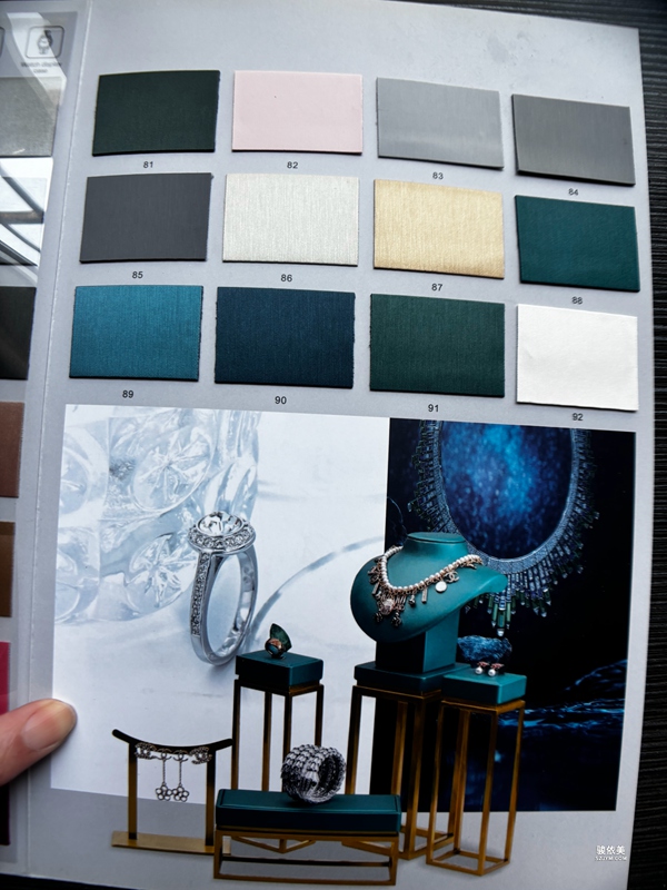
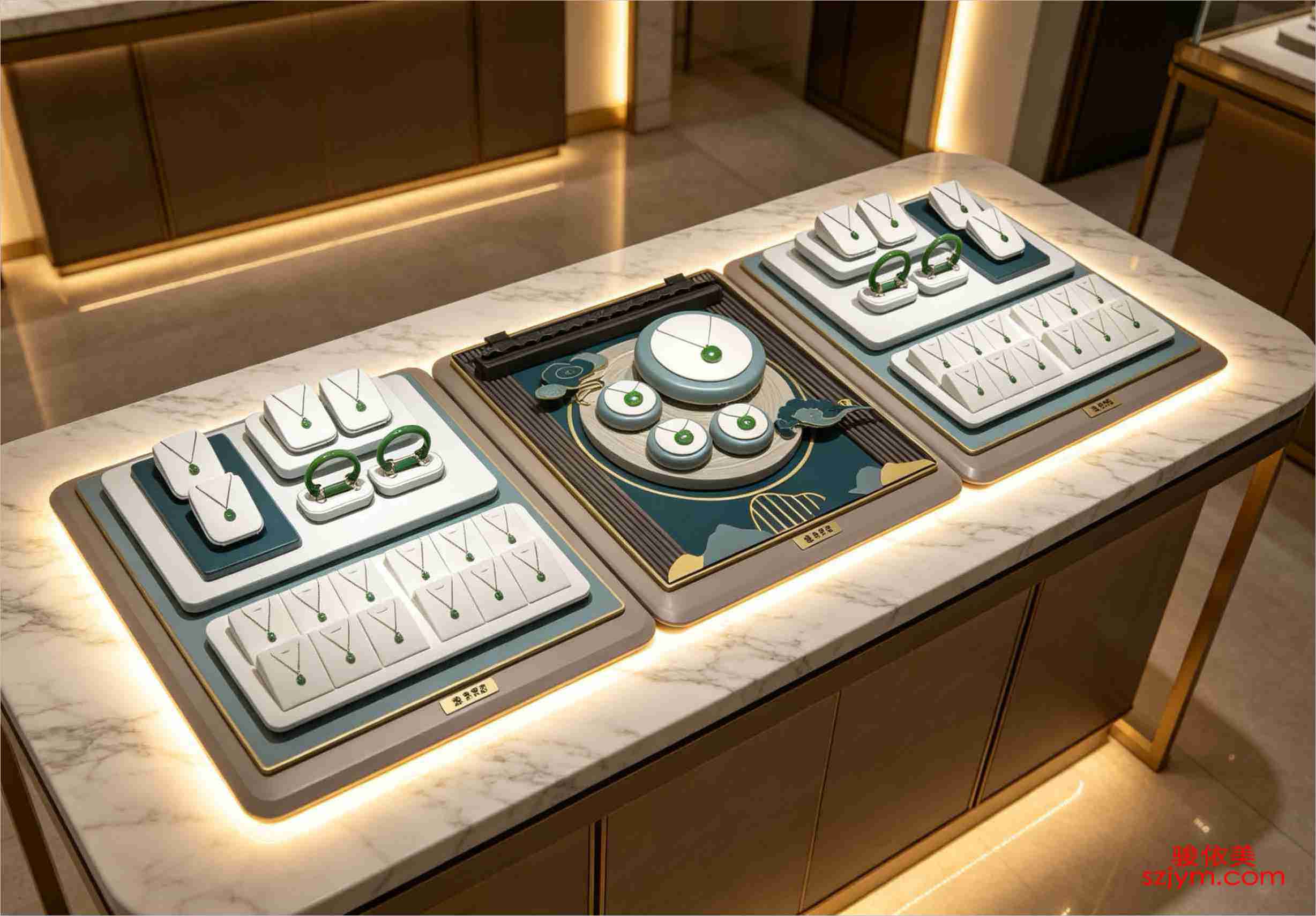
答:高度递减是铁律——入口 1.5 米高柜制造冲击,中部 1.2 米便于互动,深处 0.9 米营造亲密。背景色讲究呼应:深黑、深蓝衬钻石火彩,浅米、浅灰衬黄金珍珠。留白即价格信号,宁疏勿密。NRF 调研显示,设置主题陈列台的门店关联品类连带率平均 +22%;柜台留白每增加 10%,高客单成交概率约 +6%。英国 Granite Jewellers 改造陈列环境后,平均停留 4→11 分钟、试戴转化 28%→67%、客单价 +28%、一季度营收 +22%——道具不是摆货,是空间叙事。道具成本并非越高越好:一套模块化亚克力系统的复用率可达 85%,比一次性定制道具节省约 40% 陈列预算,却同样撑起高级感。
问:动线怎么设计留住人?
答:"环形动线 + 磁石点"最有效。入口右侧 45 度角是第一视觉焦点(停留约 3.2 秒),正前方中心第二(2.8 秒),左侧深处第三(1.5 秒);把高毛利或主推款放在第一焦点。每个"磁石点"用差异化珠宝摆台制造驻足,配合主题场景。国内某高端项目升级动线后,月均停留 4→11 分钟、试戴转化 28%→67%、月销 +38%,与 Granite Jewellers 海外案例高度一致。门店功能正从"销售终端"转向"关系载体"——停留时间,就是关系的原材料。
问:门店陈列和包装如何呼应?
答:最好的品牌,盒、袋、柜、台说同一种语言。盒子是成交前的道具、成交后的交付物;深绒衬钻石火彩、浅米衬黄金、冷灰衬白色金属。黄金 2700–3000K、钢与白金 3500–4000K、CRI>90 的灯光,应同时覆盖柜台与首页视觉。当顾客把首饰袋带离门店,包装继续在长达 11 个月里做免费曝光。周大福截至 2026-06-30 季度零售值 +15.1%、内地直营同店 +19.6%,其策略之一正是统一"盒—袋—柜—台"的视觉语言,让离店后的包装继续代言。首饰盒与珠宝包装不是成本,是离店后的延续广告。
本文为原创内容,版权归骏依美所有,如需转载请注明出处。
骏依美——让每一件珠宝首饰,都被更好地呈现与爱戴。一站式解决首饰包装
微信咨询WeChat
扫码添加微信咨询Scan QR code to add WeChat

©2005-2026 深圳骏依美首饰包装有限公司 版权所有 | 21年专注珠宝包装定制©2005-2026 Shenzhen Junyimei Jewelry Packaging Co., Ltd. All Rights Reserved | 21 Years Expertise
特别申明:网站上的图不作品牌复制,图例只作展示,如有不妥请联系我们删除!《品牌订制必需提供品牌授权书》Special Note: Images on this site are for display only, not brand copies. Contact us for removal if any issue arises. Brand customization requires a brand authorization letter.
网站备案/许可证编号:湘ICP备2023014570号Website Registration: Xiang ICP 2023014570

湘公网安备 43020302000290号


